Presentations have a lot more POP when the real clients can see how something MIGHT look. If it’s a big presentation, it’s worth the extra time & effort to wow them properly! Here are a few examples of presentations I’ve helped with. I wish I could show you more, but I am bound by NDAs.
PLEASE Note and USE the <SLIDERS> to see Before & After images. Best viewed on a desktop!


While helping Trilogy on their Cherry Dr Pepper sampling ideas, I came up with one of my own. These Smart cars were comped up to show what they could look like as a large cherry-like sample delivery method.


And if you are hauling cool cherry cars all over the country, you might as well tow them in a bowl & by a cool truck as well.


Taking sketches into realistic pieces of art & then putting them in their actual environments is very helpful. It speeds up the approval process to light speed. Which is great when you don’t have any timeline left to spare. The client’s confidence & understanding of what the final product should look like is greatly improved and it can even catch problems that weren’t on anybody’s radar.
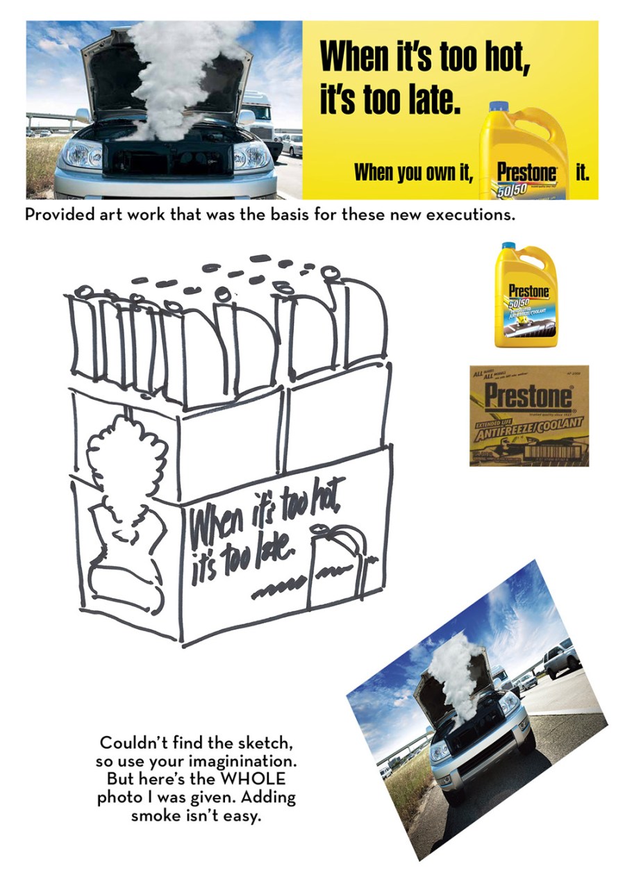

The first Prestone presentation went so well, the next one got some extra TLC (Tender Loving Comping) as well. These examples showed how die cuts and larger POS could use the same simple square artwork and be expanded to have a bigger impact in the store environment.


When all you have time for is stock for a presentation, but you KNOW you want it to have a entirely different look and feel… and of course want to show the product in the shot. Even if it’s small and subtle, Segafrdo. I’ve been known to help bridge that gap and then some. I’ve helped land clients all together or at least allow for a budget to get thrown in a direction that would have not been considered due to the leaps, not every client has the “vision” to see or make.


This is another example of showing a client, IHOP, what the in-store POS could look like.


This takes an editorial photographic style & shows how that same look could be used as inspiration for their ad series. You also get to see how the original image was a bit more revealing & hear how using plaid is always tricky from my perspective.


But HOW would the idea look in OUR space? With a average photo and some rough measurements, showing items to scale often helps seal the deal.

Sometimes showing many different iterations of signage on the exterior rendering of a building in day and night is a very helpful endeavor.
You must be logged in to post a comment.