A large sampling of logos I’ve created from the ground up, refreshed, or led a team on.

I redesigned one of DFW’s largest hospital system Baylor’s logo. I’m still shocked they allowed me to update their logo, and by “THEY,” I mean the multitude of committees. So I guess it shouldn’t surprise me that they’ve changed it again?! Rolando Murillo assisted on the finish out of the curve’s perfection.
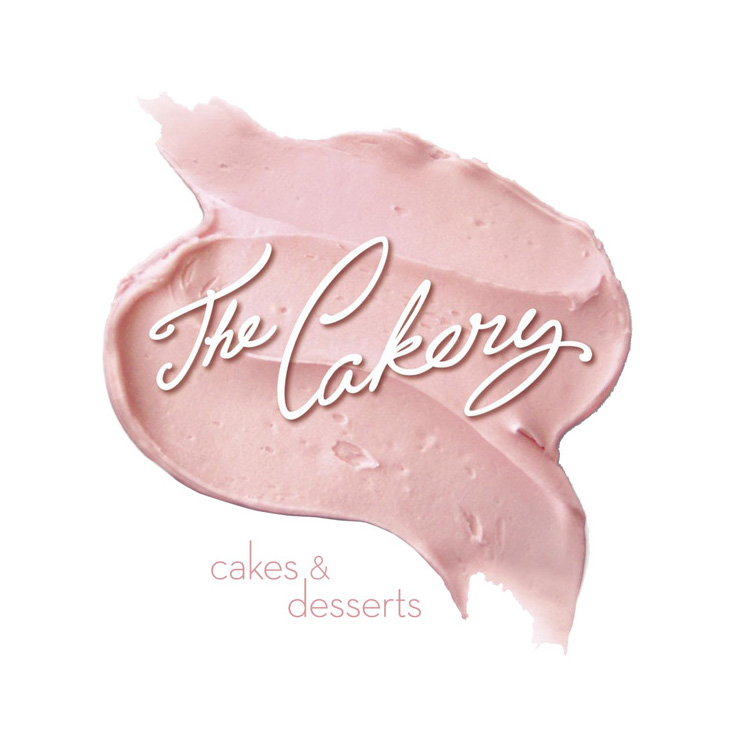
A quaint little bakery in Southlake, TX. I really wanted to recreate this logo in 3D on the brick above the awning, but they had strict strip center codes. I also discovered my X-acto and sculpting skills were useful when working with icing.

Winning name/logo for Clampitt Paper Company’s first ever wine label competition.

Fun flavored milk beverage for young adults.

Revised this family of logos for a supplement and it’s maker BioEnergy. The top three are the previous logos that feel mismatched. The lower three are how we provided cohesion to their brands. Rolando Murillo & Chris Weiland also helped get these logos to their final state.

Logos for an app developer and their music guessing game.

March Madness basketball party.

Two concepts for a LASIK eye surgeon.

First a minor update, but crucial when the logo get’s reduced in size or is used by itself as an icon “M”. Then a new owner wanted a new look and feel. Go check out all their new merchandise which I had a hefty helpful hand in producing. And in case you didn’t know, MorphMarket is the largest marketplace for slithery & creepy crawlys in the world!

Young adult spiritual growth retreat.

Fun southern themed meal and concert. Elliott Park illustrated the drumstick.

Based on the original design, I reconstructed the logo for a hair care line.

Online search, connect, and payment service for contractors.

WampCorp ©’s exclusive design division.

Someone thankfully lost the original logo files for this construction cost estimator, so I was asked to help them recreate it. I immediately began to point out some problem areas and to suggest better logo solutions that would increase legibility and usage. I later helped them transition some of the elements to a new division.
You must be logged in to post a comment.